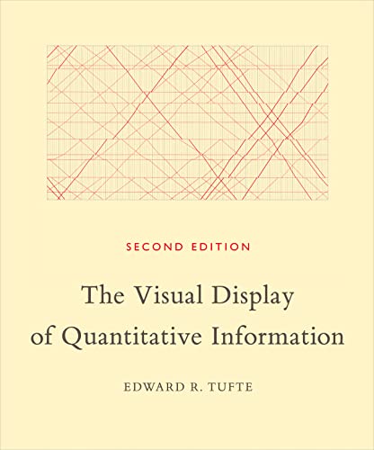
Better than a summary
The Visual Display of Quantitative Information summary
Edward R. Tufte
No credit card required · Cancel anytime
The Visual Display of Quantitative Information by Edward R. Tufte is a groundbreaking book that explores the best practices for presenting data visually. With captivating examples, Tufte illustrates how to effectively communicate complex information through clear and innovative graphics.
Table of Contents
- The Visual Display of Quantitative Information: summary of key ideas
- What is The Visual Display of Quantitative Information about?
- The Visual Display of Quantitative Information Review
- Who should read The Visual Display of Quantitative Information?
- About the author
- Book summaries like The Visual Display of Quantitative Information
- People also liked these summaries
- The Visual Display of Quantitative Information FAQs
The Visual Display of Quantitative Information
Summary of key ideas
Understanding Data Visualization
In The Visual Display of Quantitative Information, Edward R. Tufte delves into the art and science of data visualization. He begins by discussing the importance of presenting data in a clear and effective manner, emphasizing that the visual display of information should be designed to reveal the truth about the data, rather than to deceive or obscure it.
Tufte introduces the concept of data-ink ratio, which refers to the proportion of ink used to represent data in a graphic. He argues that the more ink used to represent data, the better, as long as it doesn't clutter the graphic. He also emphasizes the importance of maximizing the data-ink ratio to avoid unnecessary distractions and to ensure that the data is the focal point of the visualization.
Principles of Effective Data Visualization
Next, Tufte outlines several principles for creating effective data visualizations. He discusses the importance of using clear and accurate scales, avoiding chartjunk (unnecessary or distracting elements in a graphic), and presenting data in a way that encourages comparisons and reveals patterns. He also introduces the concept of small multiples, which involves using multiple small graphics to display different aspects of the same data, allowing for easy comparison.
Tufte then explores the use of different types of graphs and charts, such as line graphs, bar charts, and scatterplots, and provides guidelines for choosing the most appropriate type of visualization for a given dataset. He also discusses the design of tables, emphasizing the importance of clarity, simplicity, and precision in presenting tabular data.
Case Studies and Historical Context
Throughout The Visual Display of Quantitative Information, Tufte uses numerous historical and contemporary examples to illustrate his principles and guidelines. He analyzes the work of influential statisticians and graphic designers, such as William Playfair and Charles Joseph Minard, and highlights their innovative and effective approaches to data visualization.
He also discusses several case studies, including the visual representation of Napoleon's march to Moscow and the design of the New York City subway map, to demonstrate how effective data visualization can provide valuable insights and aid decision-making. Tufte's historical and contemporary examples provide a rich context for understanding the evolution and impact of data visualization.
Challenges and Future of Data Visualization
In the latter part of the book, Tufte addresses some of the challenges and potential pitfalls associated with data visualization. He warns against common mistakes, such as distorting the scale of a graph or using misleading labeling, and emphasizes the importance of maintaining integrity and honesty in presenting data.
He also discusses the future of data visualization, exploring emerging technologies and innovative approaches that have the potential to transform the way we interact with and understand data. Tufte's insights into the challenges and future directions of data visualization provide a thought-provoking conclusion to The Visual Display of Quantitative Information.
Conclusion
In conclusion, The Visual Display of Quantitative Information is a comprehensive and influential exploration of the principles, practices, and potential of data visualization. Tufte's book serves as a valuable resource for anyone interested in effectively communicating quantitative information, whether they are statisticians, designers, researchers, or decision-makers. By emphasizing the importance of clarity, honesty, and innovation in data visualization, Tufte's work continues to shape and inspire the field of information design.
More knowledge in less time

Read or listen
Get the key ideas from nonfiction bestsellers in minutes, not hours.

Find your next read
Get book lists curated by experts and personalized recommendations.

Shortcasts
We've teamed up with podcast creators to bring you key insights from podcasts.
What is The Visual Display of Quantitative Information about?
The Visual Display of Quantitative Information (1983) by Edward R. Tufte is a groundbreaking book that explores the design and presentation of statistical data. Tufte discusses principles for displaying complex information in a way that is clear, accurate, and visually appealing. Through numerous examples and illustrations, the book challenges traditional methods of data visualization and offers innovative techniques for conveying data effectively.
The Visual Display of Quantitative Information Review
The Visual Display of Quantitative Information (1983) by Edward R. Tufte is an essential read for anyone interested in data visualization and information design. Here's why this book is worth your time:
- Offers a wealth of practical examples that demonstrate how to effectively present complex information visually, making it a valuable resource for professionals and enthusiasts alike.
- Presents a clear framework for organizing and presenting data, helping readers create visually compelling and informative displays.
- With its emphasis on clarity and elegance, the book challenges traditional charting techniques, making it an engaging and thought-provoking read.
Who should read The Visual Display of Quantitative Information?
- Readers who want to effectively communicate data and information through visual displays
- Professionals in fields such as business, science, and research
- Individuals interested in improving their data visualization skills
Categories with The Visual Display of Quantitative Information
Book summaries like The Visual Display of Quantitative Information
 Where Good Ideas Come FromSteven JohnsonThe Natural History of Innovation4.1
 God is not greatChristopher HitchensHow Religion Poisons Everything3.9
 A Brief History of Time Stephen HawkingFrom the Big Bang to Black Holes4.4
 The Selfish GeneRichard DawkinsA landmark work in the field of biology and evolution4.4
 AntifragileNassim Nicholas TalebThings That Gain from Disorder4.5
 Physics of the futureMichio KakuHow Science Will Shape Human Destiny and Our Daily Lives by the Year 21004.1
 MusicophiliaOliver SacksTales of Music and the Brain, Revised and Expanded Edition4.3
 How Music Works David ByrneHow circumstance and creativity collide in tune4.4
 The Sports GeneDavid EpsteinInside the Science of Extraordinary Athletic Performance4.3
 On intelligence Jeff Hawkins, Sandra BlakesleeHow a New Understanding of the Brain Will Lead to the Creation of Truly Intelligent Machines3.9
 Nutrition and Physical DegenerationWeston Andrew PriceA Comparison of Primitive and Modern Diets and their Effects4.2
 GutGiulia EndersThe Inside Story of Our Body’s Most Underrated Organ4.3
 Bad ScienceBen GoldacreA behind-the-scenes look at the bogus science used to mislead us every day.4.4
 Moonwalking with EinsteinJoshua FoerThe Art and Science of Remembering Everything4.2
 Do No Harm Henry MarshStories of Life, Death, and Brain Surgery4.2
People ❤️ Blinkist
Become a member of our community of 44 million people

96k ratings

73k ratings
Laura H.
When I saw Blinkist had produced an infographic style Blink for the Rich Dad, Poor Dad book, it was a good reminder of the concepts I loved.
Thi Viet Quynh N.
Great app. Good selection of book summaries you can read or listen to while commuting. Instead of scrolling through your social media news feed, this is a much better way to spend your spare time in my opinion.
Jonathan A.
Clearly communicates the value proposition of the most popular book summaries and offers a relatable, tangible template that I can use immediately.
People also liked these summaries
 Fluent ForeverGabriel WynerHow to Learn Any Language Fast and Never Forget It4.3
 Life at the Speed of Light J. Craig VenterFrom the Double Helix to the Dawn of Digital Life4.3
 The Language InstinctSteven PinkerHow the Mind Creates Language4.0
 A mind for numbersBarbara OakleyHow to Excel at Math and Science (Even If You Flunked Algebra)4.3
 The Structure of Scientific RevolutionsThomas S. KuhnA groundbreaking study in how science progresses4.3
 SmarterDan HurleyThe New Science of Building Brain Power3.6
 An Astronaut’s Guide to Life on EarthChris HadfieldWhat Going to Space Taught Me About Ingenuity, Determination, and Being Prepared for Anything3.9
 The Demon-Haunted WorldCarl SaganScience as a Candle in the Dark4.3
 Moore’s LawArnold Thackray, David Brock and Rachel JonesThe Life of Gordon Moore, Silicon Valley’s Quiet Revolutionary4.3
 Grain BrainDavid PerlmutterThe Surprising Truth about Wheat, Carbs, and Sugar4.3
 What If?Randall MunroeSerious Scientific Answers to Absurd Hypothetical Questions3.4
 On ImmunityEula BissAn Inoculation3.3
 Sonic BoomJoel Beckerman (Autor), Tyler GrayHow Sound Transforms the Way We Think, Feel, and Buy3.4
 Consider the ForkBee WilsonHow Technology Transforms the Way We Cook and Eat3.8
 Driven Paul Lawrence & Nitin NohriaHow Human Nature Shapes our Choices3.6
Trusted by the world's leading brands

Powerful ideas from top nonfiction
Try Blinkist to get the key ideas from 7,500+ bestselling nonfiction titles and podcasts. Listen or read in just 15 minutes.
Get started
Blink 3 of 8 - The 5 AM Club
by Robin Sharma
The Visual Display of Quantitative Information FAQs
What is the main message of The Visual Display of Quantitative Information?
The main message of The Visual Display of Quantitative Information is the effective use of data visualization for better communication.
How long does it take to read The Visual Display of Quantitative Information?
The reading time for The Visual Display of Quantitative Information varies depending on the reader's speed. The Blinkist summary can be read in a few minutes.
Is The Visual Display of Quantitative Information a good book? Is it worth reading?
The Visual Display of Quantitative Information is worth reading as it provides valuable insights into data visualization, helping you effectively communicate complex information.
Who is the author of The Visual Display of Quantitative Information?
The author of The Visual Display of Quantitative Information is Edward R. Tufte.