Better than a summary
Responsive Web Design with HTML5 and CSS summary
No credit card required · Cancel anytime
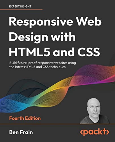
Responsive Web Design with HTML5 and CSS by Ben Frain is a comprehensive guide that teaches you how to create websites that work seamlessly on any device. It covers fluid grids, flexible images, and media queries, providing practical examples and best practices.
Topics
Table of Contents
- Responsive Web Design with HTML5 and CSS: summary of key ideas
- What is Responsive Web Design with HTML5 and CSS about?
- Responsive Web Design with HTML5 and CSS Review
- Who should read Responsive Web Design with HTML5 and CSS?
- About the author
- Book summaries like Responsive Web Design with HTML5 and CSS
- People also liked these summaries
- Responsive Web Design with HTML5 and CSS FAQs
Responsive Web Design with HTML5 and CSS
Summary of key ideas
Understanding Responsive Web Design
In Responsive Web Design with HTML5 and CSS by Ben Frain, we begin by exploring the fundamentals of responsive web design. The author emphasizes the importance of creating websites that can adapt to various screen sizes and devices. We learn about fluid grids, flexible images, and media queries, which are essential components of responsive web design.
Frain also discusses the mobile-first approach, where the design process begins with the smallest screen size and progresses to larger ones. He highlights the significance of optimizing user experience for mobile devices, given the increasing prevalence of mobile browsing.
Implementing Responsive Techniques
The book then delves into the practical implementation of responsive techniques. Frain provides insights into writing clean HTML markup, using semantic elements, and structuring content in a way that facilitates responsive design. He also introduces us to various CSS features and methodologies, such as flexbox and grid layouts, which enable us to create responsive and visually appealing designs.
Furthermore, the author emphasizes the importance of optimizing images for different screen sizes to ensure fast loading times. We learn about different image file formats, responsive image techniques, and the use of media queries to deliver appropriate images based on the user's device.
Exploring Advanced CSS Features
In the next part of the book, Frain takes us on a deep dive into advanced CSS features and techniques. We explore the use of modern CSS properties for typography, color, and layout, including custom properties (CSS variables), responsive typography, and color modes. The author also introduces us to the concept of Scalable Vector Graphics (SVGs) and demonstrates how they can be used to create resolution-independent graphics for responsive web design.
Frain also covers CSS animations, transitions, and transformations, showing how these can be used to enhance user interactions and create engaging visual effects. He provides practical examples and code snippets to illustrate the application of these techniques.
Mastering Forms and Bonus Techniques
As we progress further, the book focuses on building responsive HTML forms. Frain explains how to create accessible and user-friendly forms by leveraging the new input types, attributes, and form validation features introduced in HTML5. He also discusses the use of CSS to style and enhance the appearance of forms.
In the final chapters, the author presents a range of bonus techniques and parting advice. These include topics such as performance optimization, accessibility best practices, and tips for maintaining responsive web designs. Frain's parting advice emphasizes the importance of continuous learning and keeping up with the ever-evolving landscape of web technologies.
Conclusion
In conclusion, Responsive Web Design with HTML5 and CSS by Ben Frain provides a comprehensive guide to creating responsive websites using modern HTML and CSS techniques. The book equips readers with the knowledge and practical skills needed to design and develop websites that deliver a consistent and optimized user experience across various devices and screen sizes. Whether you're a beginner or an experienced web developer, this book offers valuable insights into the world of responsive web design.
More knowledge in less time

Read or listen
Get the key ideas from nonfiction bestsellers in minutes, not hours.

Find your next read
Get book lists curated by experts and personalized recommendations.

Shortcasts
We've teamed up with podcast creators to bring you key insights from podcasts.
What is Responsive Web Design with HTML5 and CSS about?
Responsive Web Design with HTML5 and CSS by Ben Frain is a comprehensive guide that teaches you how to create responsive websites that work seamlessly on any device. It covers the principles of responsive design, HTML5, CSS, media queries, and more. With practical examples and best practices, this book is essential for web developers and designers looking to enhance their skills.
Responsive Web Design with HTML5 and CSS Review
- Explains key concepts clearly, making complex ideas accessible even for beginners.
- Provides practical examples and hands-on exercises to reinforce learning and application.
- Keeps readers engaged with its up-to-date techniques and insights into the rapidly evolving world of web design.
Who should read Responsive Web Design with HTML5 and CSS?
Web developers and designers who want to create modern, responsive websites
Professionals looking to update their skills and stay current with the latest web design techniques
Students and beginners seeking a comprehensive guide to HTML5 and CSS for responsive web design
Categories with Responsive Web Design with HTML5 and CSS
Book summaries like Responsive Web Design with HTML5 and CSS
 Big DataMayer-Schonberger, CukierA Revolution That Will Transform How We Live, Work and Think4.3
 On intelligence Jeff Hawkins, Sandra BlakesleeHow a New Understanding of the Brain Will Lead to the Creation of Truly Intelligent Machines3.9
 The Signal and the NoiseNate SilverWhy So Many Predictions Fail — but Some Don't4.2
 You Are Not a GadgetJaron LanierA Manifesto3.9
 The Future of the MindMichio KakuThe Scientific Quest to Understand, Enhance, and Empower the Mind4.4
 Too Big to IgnorePhil SimonThe Business Case for Big Data4.1
 The Intel TrinityMichael S. MaloneHow Robert Noyce, Gordon Moore and Andy Grove Built the World’s Most Important Company4.2
 BreakpointJeff StibelWhy the Web will Implode, Search will be Obsolete, and Everything Else you Need to Know about Technology is in Your Brain4.0
 Information Doesn’t Want to Be FreeCory DoctorowLaws for the Internet Age3.6
 The Master AlgorithmPedro DomingosHow The Quest For The Ultimate Learning Machine Will Remake Our World4.4
 The InevitableKevin KellyUnderstanding the 12 Technological Forces That Will Shape Our Future4.2
 StretchKarie Willyerd and Barbara MistickHow to Future-Proof Yourself for Tomorrow’s Workplace3.8
 The Filter BubbleEli PariserWhat the Internet is Hiding From You4.0
 IrresistibleAdam AlterThe Rise of Addictive Technology and the Business of Keeping Us Hooked4.2
 The Innovator’s HypothesisMichael SchrageHow Cheap Experiments Are Worth More than Good Ideas3.8
People ❤️ Blinkist
Become a member of our community of 44 million people

96k ratings

73k ratings
Sven O.
It's highly addictive to get core insights on personally relevant topics without repetition or triviality. Added to that the apps ability to suggest kindred interests opens up a foundation of knowledge.
Thi Viet Quynh N.
Great app. Good selection of book summaries you can read or listen to while commuting. Instead of scrolling through your social media news feed, this is a much better way to spend your spare time in my opinion.
Guillem B.
Life changing. The concept of being able to grasp a book's main point in such a short time truly opens multiple opportunities to grow every area of your life at a faster rate.
People also liked these summaries
 Age of DiscoveryIan Goldin (Author), Chris KutarnaNavigating the Risks and Rewards of Our New Renaissance 4.3
 Sensemakingby Christian MadsbjergWhat Makes Human Intelligence Essential in the Age of the Algorithm4.0
 UX StrategyJaime LevyHow to Devise Innovative Digital Products That People Want 4.1
 Weapons of Math DestructionCathy O'NeilHow Big Data Increases Inequality and Threatens Democracy4.1
 VaporizedRobert TercekSolid Strategies For Success in a Dematerialized World4.4
 The Dark NetJamie BartlettInside the Digital Underworld3.1
 Changing the SubjectSven BirkertsArt and Attention in the Internet Age4.1
 Streaming, Sharing, StealingMichael D. Smith and Rahul TelangBig Data and the Future of Entertainment3.5
 The Distracted MindAdam Gazzaley, Larry D. RosenAncient Brains in a High-Tech World4.1
 Life 3.0Max TegmarkBeing Human in the Age of Artificial Intelligence 4.3
 The Age of Spiritual MachinesRay KurzweilWhen Computers Exceed Human Intelligence4.3
 Bad BloodJohn CarreyrouSecrets and Lies in a Silicon Valley Startup4.2
 The One DeviceBrian MerchantThe Secret History of the iPhone3.6
 BuiltRoma AgrawalThe Hidden Stories Behind our Structures4.6
 Ghost in the WiresKevin D. Mitnick, William L. Simon, Steve WozniakMy Adventures as the World's Most Wanted Hacker4.5
Trusted by the world's leading brands

Powerful ideas from top nonfiction
Try Blinkist to get the key ideas from 7,500+ bestselling nonfiction titles and podcasts. Listen or read in just 15 minutes.
Get started
Blink 3 of 8 - The 5 AM Club
by Robin Sharma